slider

Showing posts with label project life tutorial. Show all posts

8/22/14

Project Life: How I photograph my pages


As I was photographing this spread in my Project Life album (and staring at my toes), I decided to play around with my camera and show you how I take my completed Project Life photos AND also why I take my photos in manual mode. 

Before I get started, though, I just wanted to share that I definitely DO NOT consider myself a photographer.  I take pictures.  Usually of my kids and pretty papers.  That's about it.  I do, however, really love taking photos, setting up shots and finding pretty light.  Everything I know about my camera and photography, I taught myself by trial and error.  

MY CAMERA
I have a Canon T1i. I purchased it as a kit camera from Costco about 4 years ago and have greatly enjoyed it!  It gives me the freedom to shoot in manual mode, and that's what I love most.  I might upgrade one day, but we shall see.  


For the most part, I set my photos up as you see in the above two pictures.  I use a large white foam board (that I ordered from Amazon, but you can find them at Target or office supply stores), a stool to stand on, some pretty light and my camera.  I've really paid close attention to my room and know when it gets the best light.  Morning light isn't good because it's too harsh and anything after 4:00 p.m. gives a blueish-tint to my photos that drives me batty.  Anytime between 11-3:30 is pretty perfect in this room.  To the right in the photo above, I have two large windows, and you can see how I set my white board up a few feet from my wall.  I always make sure that my board is outside of any direct sun rays.  And I also try to position my board so I don't see any harsh shadows on my projects (this applies more to scrapbook pages where you have lots of layers and depth).

I then lay my spread down on the white board trying to center it in the middle.  I always stand behind my board (to not cast a shadow on my project), and I always photograph my spreads (or any project, really) with them facing the sun (so it's usually upside down to me).  By facing them towards my windows, I'm (hopefully) eliminating any shadows or overcasts on my project. 

Then I focus and take my photos.  
I use the lens that came with my camera.  While I love my 50mm lens, I have a difficult time getting a good focus inside.  My kit lens is usually pretty good as long as I have good light.  


MANUAL MODE
So I mentioned previously that I only shoot in manual mode.  It took me a while to feel comfortable enough to do that because it does require me to pay attention to details and settings (ISO, shutter speed, aperture, exposure...).  BUT...I wouldn't have it any other way.  You probably know that I like my photos bright and light, and shooting in manual mode is the only way I've found to do that (without having to do lots of post processing). 

When I take my photos, the main thing I change is my light meter, or exposure.  I'm basically "over-exposing" my photos.  BUT...the thing you have to remember about exposure is that it's totally dependent on your light source.  If I'm outside on a pretty day, or even on a cloudy day, I'm less likely to play around with my exposure (maybe just a little).  If I'm indoors and am trying to get as much light as possible, I'm definitely playing around with my exposure.  My goal isn't to over-expose or make my photos seem unnatural.  My goal is to make them look like they do to the naked eye (and I have really good eyesight, so maybe I see things naturally a little over-exposed. Who knows?).

Below are a few examples of what I'm talking about and why I choose to play with my light meter as I photograph. 

This photo was taken at "0", or basically the setting my camera would be on if I used the automatic settings and let my camera do all of the work.  It's so dark.  Like really dark.  My room was so bright and light, and this is just not what I was looking down on. 

Ok...so let's bump it up a little.
(Get out your manual and play around to see how to do this...)

The light meter is divided into thirds, so I increased my exposure by 1/3.  
Nope.  Can't do it.  It's still way too dark.

And another increase...
It's a little lighter, but still not the same as what I'm seeing with my naked eye. 


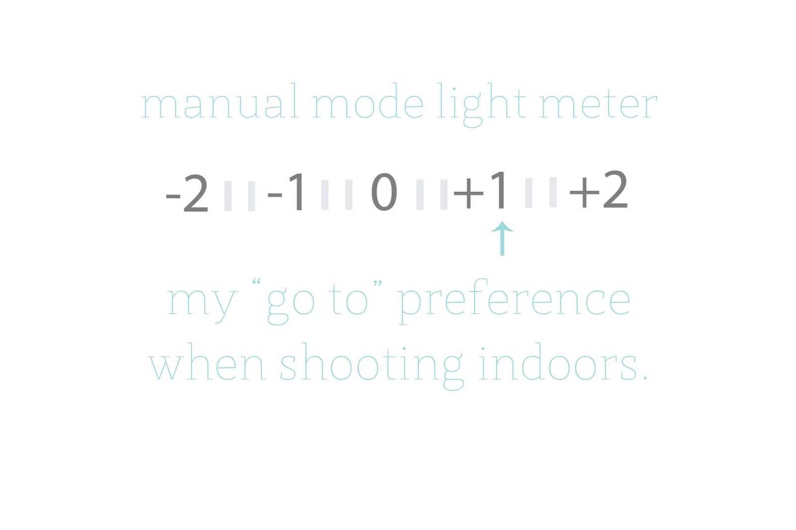
Now I'm at +1 on my light meter.
My white board is actually looking white, instead of grey and the colors on my project are starting to pop a little.  

Let's go up a little more to see what happens...

I've increased my exposure a little more and you see the board is brighter and whiter.   It looks pretty decent from this photo, but when I uploaded it to my computer, it was actually a little too blown out for my liking. 

So...I went with the +1 exposure photo, cropped my image, removed the color cast (that's the grey undertones you see in the above photo...I can share more about this if anyone is interested) and tweaked my exposure just a wee bit in Aperture and then uploaded it to my blog.  

Here is a look at my cropped spread...


That's why I shoot in manual mode.  Because I want to have the control over the light and brightness of my photos.  I want them to look like I see them, not like how my camera thinks they should look. 
If you have never ventured out of automatic, I highly recommend it!  Get out your manual and read about your settings.  Play around with your camera and take a million photos just to see what happens.  I suggest starting out with still objects.  Busy kids make for blurry photos, and that can be frustrating when you are trying to learn.  Starting with objects around your house, or even your projects would be the perfect place to begin!!  Good luck!  Let me know how it goes!

7/26/14

Gossamer Blue: Creative Uses for Journaling Cards


I always try to get the most use out of my products, but sometimes my spreads are so photo heavy that I don't have a lot of leftover room for journaling cards.  Combining your cards and some common tools (think paper trimmer, circle punch, sewing machine) can stretch your supplies and help your creativity flow!


When I start organizing my photos and memorabilia for the month, I always pop a few journaling cards randomly into my pockets.  Although they may not stay in the same spot, they serve as a reminder to add in a few details about our week or month.  The rest of the cards sit in a pile by my photos and once my photos and memorabilia are in place, I grab them out and see what might work with my spread.

Let me share a few of my favorite ways to use journaling cards!


1. Trimming cards to create tags and journaling spots.

I loved the "sweet memories" sentiment on this journaling card, but I only had a few words to add to this photo, so I didn't want to use the entire card.  To make it work with my photo, I trimmed out the sentiment and used it as a journaling spot and label.  I added in one of the My Mind's Eye Chipboard banners for a little glitzy touch.


2. Using your punches to create embellishments.

For this photo, I used my circle punch to punch out part of a journaling card.  I adhered it to the middle of my photo using my tiny attacher and added my journaling with a white gel pen around the photo.  Simple, but super effective!


3. Using journaling cards as accents.

This vellum journaling card was trimmed down to fit a card that is on the other side of this pocket.  I added a flair button to the middle as an accent.  The card is a little smaller than the pocket and I love the see-through effect it has!


4. Sewing vellum to a card to create a transparent pocket.

And what's a Life Pages spread without a vellum pocket?  Here I used a journaling card and sewed on a small piece of vellum to act as a pocket to hold our Easter basket clues from the Easter bunny.  I added a small label with some journaling to the outside of the pocket to finish it off!

How fun, right?  Thanks so much for joining me today!!  I hope I have inspired you to take a closer look at those journaling cards and your supplies to get the most use out of your products as possible!!  

7/14/14

Gossamer Blue: Organizing Your Project Life Process


I have a new Project Life Process video up at Gossamer Blue.  I really loved putting this spread together and talking through my process.  The more I talk about it, the more I realize what works for me and what doesn't!!!  


7/3/14

Project Life & the Collect App


My Project Life albums are very photo heavy this year.  Since I decided to use the 4x6 slots as full sized photos, I feel like my photos are taking the front stage this year and I love that!  Not to mention that it makes printing my photos and putting my spreads together so much easier.  One thing I have noticed, though, is that I'm not always present in my album.  My voice is there because I'm telling these stories though my eyes, but I don't have very many photos of me in our everyday life.  With May being National Photography Month, I decided to challenge myself to capture one photo of my daily life each day.  It was quite a project to undertake (although it totally doesn't sound like it should have been, but it was...).  But like most projects, it was so super rewarding and I am so thankful I have these memories documented!  The photos are so fun to look back on and I love that I have one photo for each day of May!

To keep myself accountable and also to have a daily reminder to capture a photo, I used the Collect App on my iPhone.  I love that I got a little message every afternoon asking me if I had "collected" my photo for the day.  It was easy to remember to snap a photo at the beginning of the month because the project was fun and new, but after a few weeks, it slipped my mind almost every day.  The Collect App is great because it gives you a thumbnail calendar photo throughout the month, so you can track your progress and see your library of photos grow.


I knew I wanted to keep all of these photos together in my Project Life album, so I decided to print them out in the Collect App style with the photo caption and date included on each picture.  It's super easy to export the photos to your camera roll once you figure out the settings.  Here are my steps for exporting to my camera roll.


When you are ready to export your photos, click the little box with the arrow in the bottom left hand corner of the calendar screen.


A window will open up on your screen and you will have several options.  Click the "export photos" option.


Select the starting and ending date for the photos you would like to export. 
(The photo calendar will open up and you can select your dates).


The Collect App offers several different styles and photos sizes with various fonts.  They are all pretty cool, but Annette is my favorite.  :)  

Since I had so many photos, I decided to stick with the 3x4 Polaroid style, but the other options are just as awesome!
Click "Export style" to see options and choose which one you like best!


The last thing to do is click "Export" at the bottom of your screen.  Your start/end dates and the export style should be all set and ready to go!

Once the images are on my camera roll, I just export them to my home computer and then print two 3x4 photos per 4x6 piece of photo paper!  It seems like a lot of steps, but it really is an easy process!!


I used two Project Life Design F page protectors for my photos.  I trimmed the far right column off of each one to give me three rows and three columns.  That left with me a few extra pockets, so I added in a title, journaling card and some embellishments from the July Gossamer Blue kits


I kept the embellishments rather simple since the pages themselves are so photo and text heavy.  Simple stickers around my page added a little detail, but didn't make my pages too busy.


Since all of the photos have a caption and date, I slipped a Gossamer Blue journaling card into a pocket and added a quick little note about the process and photos.


I love that I have these photos.  Taking a photo a day is kind of draining, but looking back, I'm so thankful I did this project!!  


6/11/14

Playing Project Life Catch Up


This is my fourth year doing Project Life and this is the fourth Summer that I've fallen behind.  It's just the nature of the season, and I've come to accept that.  Life is busy, and with two kids in tow 24-7, there isn't much time leftover for playing around with my Project Life album.

I'm blaming "summer", but in all honesty, I had only one week of May documented, so I guess I tend to slack off during both Spring and Summer.  :)

This week, though, I was determined to get back on track and play catch up in my album.  It didn't dawn on me that I actually had a process until I started doing it, and I thought I would share my process here for anyone else who needs a little "get back on track" inspiration.


STEP 1
Print those photos.
 I usually do this step the night before I am going to work on my Project Life spreads.  This is definitely my least favorite part for some reason.  It's time consuming and involves loading a printer, trimming photo paper, etc.  It's just not as much fun as playing with pretty supplies, in my opinion. 

I print all of my photos at home on my Canon Pixma MX780.  I love love love my printer and will cry the ugly cry if anything ever happens to it.  I print exclusively on Ilford Galerie Smooth Pearl Photo paper.  I've tried several other brands, as well as the other Ilford papers, but the Smooth Pearl is my favorite.  I swear by it and will not print on anything else.  The quality is far better than any photos I've ever received, either personally or professionally.   Right now, I have a large box of the 8.5x11 photo paper, which I trim down to 4x6 for my photos, but I do love the box of 4x6 photo paper.

Oh...and just a note about printing from a home printer.  I definitely recommend playing around with your settings to see how you can conserve ink.  I did two test prints (using the Ilford Smooth Pearl paper)...one with my settings set to "high quality" and the other with my settings set to "standard quality".  I could not tell enough of a difference between the two photos, so I print using the standard setting for photo paper.  I find that my ink cartridges last much longer on this setting, which saves me a few bucks in the long run.


STEP 2
Use your "go-to" page protector.
Don't try to get creative and stress yourself out with trying something new and different.  There is definitely a time for that, but stepping outside of your box AND playing catch up do not usually mix well together.  For me, my "go to" is the Design A page protector.  It's my comfort zone and really requires minimal thinking or cutting on my part.  Since I print my photos to fill the entire size of each pocket, I can easily fill up each 4x6 spot and then move on to the middle row of 3x4 pockets.  


STEP 3
 Tackle the remaining pockets.
After I fill in the 4x6 slots with my photos, I begin to address the middle row of 3x4 pockets.  To keep things simple and get my spreads finished, I designate each pocket one type of item:  either a filler card, photo, journaling card or a piece of memorabilia.  I usually start by shuffling through my journaling cards and filler cards and finding two that coordinate with my photos.  After I slip those in the pockets, I'll check out my memorabilia pile and see if I have anything that pertains to these particular days.  My go-to is usually artwork from my children trimmed down to fit in the 3x4 pocket.
The last step is to take a look at my photos and print out one photo either 3x4 to fill the entire slot, or 3x3 and then back the photo with a coordinating journaling card.
(Note: I usually work on both the left and right side together and I approach each side as I mentioned above.  Think: two journaling cards, two filler cards, two photos, two pieces of memorabilia).


STEP 4
Keep the embellishments simple.
The finishing touches for all of my spread are little bits and pieces....tags, paperclips, stickers, etc.  Sometimes I add more embellishments than others, but when I'm playing catch up, I tend to keep it pretty simple.  Date stamps and sentiments stamps are my go-to and are perfect for adding a little detail without being too overwhelming or time consuming. 

And that's my Project Life catch up process.  I'm currently completely caught up on my album and it feels so awesome!  My process is definitely nothing too fabulous, but it's an organized plan that keeps things moving along and gets those spreads finished!

Do you have a process for catching up on your albums?  Please share if you do!


3/22/14

Two Peas: Project Life & a Photo Collage Tutorial


I used Picmonkey to create my collages before printing.  Picmonkey makes creating uniform-sized photos a snap.  For this spread, I printed three 4x6 photos....each one was a collage of six photos.  
I love using Picmonkey to create photo collages.  If you give me more than six photos, it's pretty likely that I will give you back a collage.  Picmonkey is free to use and is so super duper easy.  As you can see in my Project Life spread, I used 2x2 inch photos in a coin page protector. I love the look of the square photos and creating a collage with Picmonkey couldn't be easier.

Here's a quick little tutorial....


Start by going to Picmonkey and choosing the "collage" option from the main screen.  This will open up a collage canvas.  Picmonkey offers a variety of different collages, but I usually like to create my own.  

Click "open photos" and select the photos you would like to use from your computer.


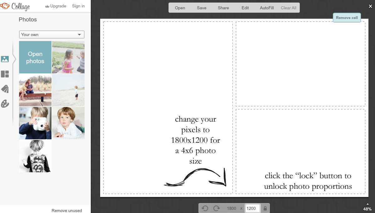
To print a 4x6 photo, you will need to change the pixel size/ratio at the bottom of the screen.  The default setting is to keep the dimensions proportional.  Click the lock button next to the pixel dimensions to unlock the photo proportions and then enter your pixel sizes.  For a 4x6 photo, the pixels will be 1800x1200 (for a landscape photo). 


**Note: at this point, I usually click the "x" in the upper right hand corner of two of the photo boxes.  This leaves me with one large photo on my canvas and makes it easier to get six 2x2 photos on a canvas.  As it is pictured above (one large photo on the left and two smaller photos on the right....you will be adding photos into that design.  Starting with one large photo gives you complete control over the placement of your photos.**


Drag and drop your photos onto the canvas.  As you drag each photo over the canvas, you will see a grey line alongside your photos.  Drop your photos next to one another to have three along the top and three along the bottom.


I like to remove the white spacing between my photos when printing 2x2 inch photographs.  I typically like a white border around my photos, but I feel like these photos are so small that a white border would make them too difficult to discern.  

To remove the white spacing, click on the "paint palette" tool on the lefthand tool bar.  Adjust the "spacing" toggle to 0.  Your photos are now borderless and ready to be saved and printed.

Click on the "save" button at the top of the screen and save to your computer.  Send to your local photo printer or home printer.  Just make sure that you are printing these photos "borderless" to keep the true 2x2 inch size.  Trim and add to your page protectors!

There you have it!  A quick and easy way to create collages of smaller sized photos.
Thanks so much for stopping by!  Let me know if you have any questions!!

xoxo

2/25/14

2/24/14

two peas in a bucket: "stuff that makes me happy" and a freebie


i have a "capture" video up at two peas in a bucket today.  this month is all about "me" so i decided to put together a spread about all of the things that make me happy.  you can see more of my process and how i altered this design f page protector in the video.


i also put together a little layered template freebie for anyone who wants to create a similar layout using the 3x4 pocket sizes.  i've included one template that has a white border (like my project life spread above), as well as one that is borderless.  you can download the templates here.  

thanks so much for stopping by today!!  happy monday!