slider

Showing posts with label scrapbooking. Show all posts

4/5/16

Maggie Holmes Design Team: Love


I haven't created in layout in quite some time and had so much fun cutting, pasting and recording our memories! I almost forgot how much fun layouts are to make! I hope you will stop by and check it out!  

3/14/16

DIY Washi Tape Circles

I have to confess that I collect washi tape....anyone else? I don't always use it (like ever), so I challenged myself this week to pull out my washi and get creative! In this week's video, I'll be sharing how to use your washi to create unique embellishments for your layouts!! Hope you enjoy and thanks for stopping by!! 


1/18/16

For the love of scraps

One of my favorite ways to create a scrapbook page is to use all of my leftover scraps and extra photos together.  I've always gravitated toward a white background, so I tend to have lots of "scrap" papers leftover.  And I print more photos than I know what to do with, so combining the two turns out to be a win-win for me!


When I'm pulling my extra supplies out to create a page, and I have a lot of elements I want to include on a page (photos, papers, etc...), I love to pull out my circle punch and go to town.

Circles are so versatile and add such a fun element to any project!  Sometimes I layer them together with other round embellishments, and other times, I crave a little more uniformity on my page. 


For this page, I used various papers and photos punched from circles and left part of a row empty to add in my title.  You just gotta love circles and you can't beat using your extra supplies to create a page!!

What's your favorite way to use up those scraps and extra photos??


12/21/15

A few favorites...


I sat down this weekend and looked back through all of the projects I've created this year.  I didn't create as many layouts as I did in years past since a lot of my creative time was spent on my Project Life albums and a few other projects, but I seriously love every single one from this year.

Grids were a common design point for a lot of my layouts. I love using grids with papers, photos and embellishments.  They are so versatile and so easy to manipulate! I love adding in alpha or letters in my grids, and from looking back through my favorites, I obviously really loved spelling out my titles in a "mixed-up" grid design!

I've mostly been working on my December Daily album, so I haven't created a layout in quite some time and I'm on the fence about continuing to document our memories through layouts. I've noticed that my actual layouts have become more "photo-focused" and less "story-focused", so I'm doing a little soul searching over the next few weeks to decide how I want to continue telling our story. 

What about you?  Do you go back and forth about creating layouts and/or other projects??  


11/12/15

Adventure


I keep coming back to a grid design.  I think it's because it's just easy to do, but can vary so much with different sized photos, papers, embellishments, etc...


For this layout, I started with a 4x6 photo of my son and then built the grid around the photo.  It's fun to cut and paste and really create without any set parameters.

This page came together SO easily, which just reaffirms my love for a grid or collage.


I broke up the papers and patterns a little by adding in a leaf embellishment from the Studio Calico Canyonland Scrapbook main kit and also added in a little wood veneer alpha for texture along the bottom strip of paper.  I've said it a zillion times before, but it's the simple embellishments that add so much impact to me!

11/11/15

Remembering those Little Moments


It's the little moments that make life so BIG and this week, I'm over on Maggie Holmes' blog sharing a layout I created all about those little moments of our life.  Using one of my favorite papers from the Shine collection, I created an interactive layout of photos, journaling and embellishments.  I just love a good interactive layout!  


Stop on by here blog to see more and read about how I created this page! And for more of my ideas on interactive pages, be sure to join me in my Big Picture Classes class, Interactive Elements - there's lots of good ideas there!!  Oh, and tons of videos and tutorials!

10/5/15

We Just Click


I love using various shapes on my projects and circles are by far my favorite!!  When I saw the chipboard circles in the Wink Wink Scrapbook kit, I knew I wanted to play around with them to create a page of round circles, punched paper circles and the chipboard elements!

I began the page by layering the paper circles on my background and then my photos.  I moved them around a little to get a good balance of patterns and text.  Then I added in the chipboard pieces, some journaling typed onto vellum and an acetate "2".


Pages like this really are so simple to create, but since they are little different than the typical "square photos" and square corners, they seem a little more complex and involved!


So what about you??  Do you love using circles on your pages?  If you've never stepped out of the "square" box, you just have to try them out! Grab your favorite circle punch and get crafty!


9/2/15

Studio Calico \\ Brimfield Reveal


Did you see the Brimfield reveal at Studio Calico yesterday?  If you didn't, well then, you are definitely missing out!  Like usual, the kits are full of beautiful papers, fun embellishments and lots of extras!  You just can't go wrong with paper and supplies, right?

Today, I thought I would start by sharing my main kit layouts.  As I mentioned in my sneak post earlier in the week, I was on the struggle bus BIG TIME when it came to creating this month.  I stopped and started, unpacked and re-packed these kits so many times it's embarrassing.  I pushed paper around and printed more photos, but the juices were dry.

After a fun time photographing our week for Week in the Life, I finally found some creative energy and got right to work!  And like normal, once I start creating, I find myself in a groove and I can't stop - hence, three layouts with the main kit. 


For this first layout, I decided to hand cut letters from the floral map paper to spell out my title.  I played around with the placement of the title in a few different spots and decided to split it up with that sweet photo of Anna.  I love how the title draws your eye to the photo.  And that floral paper was just made to be cut into letters.


This next layout is an ode to collages.  :)
You all know I can't get enough of collages, right?  I started by printing out three "strips" of our summer photos and a few pieces of patterned paper from the main Brimfield Scrapbook kit.  I wanted to keep the "extras" pretty simple here, so I chose a neutral paper to line the top and bottom of my page.  


Onto the patterned paper, I added a title using those awesome gold alpha (which was SO hard, btw, because I really really really wanted to hoard those forever).


I typed my journaling onto a piece of printer paper and then layered it in-between two photo strips.  I finished the page with a few simple embellishments and chipboard stickers.  So super simple and easy, but I love how it tells the story of our summer!


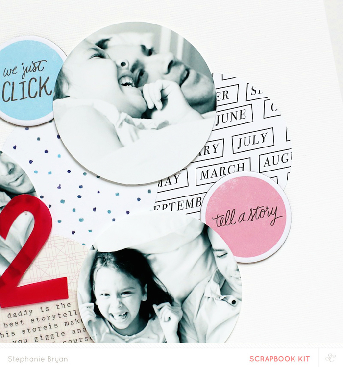
For this last layout, I pretty much just grabbed my scraps and extras and built a "pile" on the middle of my page.  I layered the white star transparency (which is kind of hard to see) on my white background and then added my layers right there in the middle of the page!


I used the packaging (the "frame" part) of the chipboard stickers to act as a border/frame for my photo and layers!  Love how it adds just the perfect amount of dimension and texture to the layout.


Between my paper layers, I slid in a tag with a note to Anna.  


And those are my main kit layouts for September!!  I'll be back with another layout and a few Project Life spreads later next week!  

Thanks so much for stopping by!!  Happy Wednesday!

8/3/15

Captured


A grid of photos and letters??  Big surprise there, right? I swear that all of my page are starting to look exactly alike - I guess it must just be the phase or mood I'm in right now.  I'm all about the photos, so the more on a page, the better!

The Studio Calico Pop Art kits are BOLD and vibrant this month!  The papers in the main kit really are so much, so if you are subscriber this month, get ready for a pop of color!  And if you aren't, then what are you waiting for??  :)


As soon as I opened my main kit and saw those big black letters, I knew I wanted to create a graphic title on my page and pair them with black and white photos.  I printed my photos to be roughly the same size as the letters and then backed a few of the photos with some of the colorful papers from the kit.


I originally had all of the "spots" on the page filled in for a complete grid, but I decided to remove a few of the papers/photos and leave some blank space on the page.  I sprinkled in a few of the transparent circles in the empty boxes and then tucked a few of the larger circles under photos and letters. 

It really was a fun page to put together and it was a great way to utilize a few photos on one page!!  I'm always trying to put as many photos on a page as I can, lol! :)


7/1/15

Studio Calico \\ Fairground Reveal


It's REVEAL day at Studio Calico.  The Fairground kits did not disappoint this month.  The papers in the main kit are some of my favorite.  I'm pretty much a big fan of anything that comes with a grid!  

I'll be sharing my Fairground projects over the next few weeks, and I thought I would start with my main kit layouts first!  These two layouts have the best pops of color (in my opinion) on the white background!  I love adding in pinks and oranges and yellows on a white canvas!  So pretty!


For this first layout, I started by trimming out some squares from the grid patterned paper in the main kit.  I wasn't really sure what I was going to do with them, so I laid them around my page and decided to cluster them altogether on one side and then pair the cluster with a photo.  I tried to balance my colors with lighter/darker shades and then by adding in a pop of yellow on my paper squares to balance out the yellow from Anna's ballet outfit.


As you can see, I kept the embellishments super simple.  Less is more....but I did stitch a few butterflies and two glitter banners along the squares. Easy peasy!


This layout just might be my favorite EVER!  And it all came about because of some extra collage style photos I had in my photo box.  I trimmed out each super small collage photo and then decided to build a grid along the bottom half of my page using photos and trimmed labels (also from the main kit). I used the transparent alpha to spell out H-O-M-E, but left the letters randomly placed, so it wasn't so perfect.  I super duper love the effect!


And these small photos and paper squares are just the best to me.  I've never met a photo collage I didn't LOVE!

And that's it for the main kits!  I'll be back to share more early next week!
We are off to the lake for our annual Fourth of July family reunion and we are so excited!


5/6/15

Escape to the Ocean


The beach is one of our favorite places.  I love that we live close enough to run away for just a weekend, or even a day-cation.  And beach photos are my favorite!  When Kerri Bradford asked me to play along with her National Scrapbook Day blog fun, I jumped right on the "escape to the ocean" cut file. I love Kerri's bubbly and fun handwriting!  It adds such a playful element to a page.  (And side note: I do not use my silhouette nearly enough!!  Am I the only one??)


I wanted to group my title around my beach photos, so I started by layering the photos onto my background and then added in a few papers layers beneath them.  I cut my title on an aqua blue card stock, but it was a little too bold for what I was hoping for.  To soften the color a little, I cut the same title again, but on vellum this time.  I layered the vellum on top of the blue card stock and then sewed each word together.  


Since the vellum and card stock were stitched together, I decided to just hot glue them to my page.  I like that hot glue adds a little bit of height and depth!


I finished my page with some handwritten journaling, which I tucked into a sewn pocket behind my photos, and the stamped place/date using Kerri's new awesome alpha stamps!!  I've never met an alpha stamp I didn't like!  

Thanks so much for having me over, Kerri!  It is always an honor to be a part of your blog!!  xo


3/10/15

Cool Dude


When did my "cool dude" grow up?  I feel like this picture was just yesterday, but in reality it was more than three years ago.  How can that be?  Sigh...  The times fly by for sure.  Thank goodness for photos and memory keeping, right???


I created this fun layout for the March reveal over at Studio Calico.  Most of these fun pieces are part of the Calypso kit with a few extras sprinkled in from the Circe kit and the Odyssey main kit.


I fell in love with the chipboard frames as soon as I opened my box of goodies.  The colors were so bright and vibrant and the chipboard was so thick and sturdy!  I knew they would look awesome all clustered together on my page!  I added a photo under the larger square frame and then trimmed various patterned papers and adhered them to the smaller frames.  The transparency paper from the Odyssey kit looked so neat in a frame with a small embellishment on top!  I love the black and white with a little bit of gold peeking through!


You really can't go wrong with frames and a grid design, I don't think!!  Is the Calypso kit making it's way to your doorstep soon??  I can't wait to see what you create!  


12/11/14

Maggie Holmes Design Team: Open Book Inspiration

Hey there!!  I'm up on Maggie's blog today sharing a feminine layout using the new Open Book collection!!  I just love the details of this collection so much....the florals, the pops of gold, the vellum!  It's all just so lovely, don't you think??!!  Here are a few little sneaks for you, but I hope you will hop on over and check the rest of the page out!!  


11/5/14

For you Sweet Girl


Today I thought I would share one of my favorite.layouts.ever.  Ever.

This is an oldie, but goodie.  It was published in one of the issues at Northridge Publishing, so it never made it onto the blog.  

When I started this page, I knew I wanted to create little hidden journaling and picture flaps on my page.    I always love to make layouts interactive with hidden journaling, pull out cards, etc...  so I opened up my silhouette program and started drawing boxes all over my 12x12 template.  Then I erased the top line of each box, cut out my template and was ready to go!

I covered the outside flips with patterned paper or pictures and then added my journaling and notes inside each flap.

As I worked on this page, I decided to dedicate this page to my daughter so i included lots of fun info about her.....her favorites....her personality...just her...

Here is a better look at the layout.


Do you like making interactive pages??  I love making them and usually hang these up in my room since they are so fun to play with!  Slipping them inside of a page protector just doesn't do them justice!!