slider

Showing posts with label color combos galore. Show all posts

7/22/13

color combos galore: sweet serenity


a new inspiration board is up at color combos galore and it's a beauty!  i love the soft colors.

i was inspired by photo #4 and the "hello" speech bubble and the twine in photo #1.  i loved how michelle deleon and wilna used twine on their recent pages and thought it would add a subtle, but striking effect on my page.

here is a look at my layout, as well as a few photos...


happy monday!! hope your week is off to a great start!

xoxo

7/12/13

color combos galore: caribbean dreams


there is a beautiful new inspiration board up at color combos galore today.  the colors are so vibrant and beautiful and the whole thing just screams party to me!!

here's a look at the colors and inspiration...


and here is my layout inspired by this board....


Inspiration Photo #4/Focus On Design: White Background
(used white cardstock base and created a "white space" design)
Other Inspiration:
Inpiration Photo #1: string (idea: hemp string); Inspiration Photo #2: resin flower (idea: cabochon type flower); Inspiration Photo #3: stacked/layered papers (idea: composition of papers); clothespin, stamping on tag, hearts (idea: clothespinned tag)


my main focus for the layout was "white space".  most of you probably know i love a good white background so i jumped at the chance to utilize this beautiful space on this page.

i also took inspiration from the "clustered" look of some of the flowers in the inspiration photo and added two clusters on my layout.  one with my photo and journaling and one in the top right corner.  i just love these colors.  especially the red....which i'm not usually too keen about.  it just makes the whole page pop!!

thanks so much for stopping by!!  happy happy friday!!


7/8/13

color combos galore: a bit of americana


there's a new inspiration board up at color combos galore.  it's called "a bit of americana" and it's the perfect mix of red white and blues.  i love how the light blue and gray is included!  


the main inspiration for my layout was photo #1 and the framed background.  i took more inspiration from photo #1 and decided to create a "patchwork" pattern for my background (inspired by the checkerboard and pieces).  i usually place my photo off to the left or right on my layout, but i felt to get the "framed effect" my photo needed to be front and center.  

here's a closer look...


thanks so much for stopping by today!  i hope your week is off to a great start!

xoxo


5/23/13

color combos galore: 244 and 245


 there are two new challenges up at color combos galore right now!!  the colors and inspiration boards are amazing, as always!  
my main inspiration for this photo was a "nautical" theme.  this is a picture of my daughter on a boat trip several years ago.  the sun was so bright and she insisted on putting on my glasses.  of course, i just had to capture this precious moment.  i layered my photo on top of some of the lovely papers from the studio calico atlantic collection to continue to "nautical" them.  the paper layers at the top of the page were inspired by the photos and colors in the inspiration board.


my focus for this challenge was journaling.  i initially thought about including my typed text on the diagonal, but then i saw my dear lizzy roller stamp sitting on my desk and i thought the sentiments would look awesome stamped along the the page.  i finished my page with the coordinating colors of the inspiration board as my paper layers.  that boy is such a cutie!!


be sure to stop by the color combos galore page for more awesome inspiration from the design team!  if you aren't already a member, email or message me your email address and i will send you out an invite!!

happy thursday!

xoxo


5/17/13

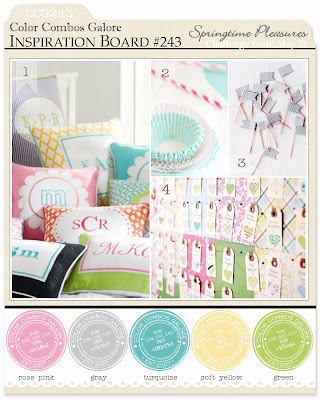
color combos galore: springtime pleasures

happy friday!

there is a new challenge up at color combos galore today!  wonderful and fun spring colors!!  

here is a look at the inspiration board....


and here is my layout...


my main inspiration was "washi tape" so i decided to create a background of washi tape strips.  after i had laid the tape down, i thought the overall colors were a little too bright, so i lightly coated them with some gesso to give them a little more muted look.  i layered my photo onto several different layers of patterned paper and used pop dots to add a little dimension to my page.  then i embellished with some wood veneers, journaling strips and stamps.  

it's such a fun page, to me!  i love the colors...and they definitely scream spring!

hope spring has come your way by now!  

xoxoxo


4/22/13

color combos galore: love, always

it's the 22nd, which means there is a new challenge at color combos galore today.

i love love love these challenges!  it's so fun to have a color inspiration board, as well as layout inspiration ideas.  the colors for this challenge were great!  and for some reason, i knew exactly what i wanted to do as soon as i saw the inspiration board.  that's pretty unlike me....i usually print it out and leave it on my desk for a few days until an idea comes to mind.  sometimes it takes fooooorever for me to commit to something, but not this time!  

here is the inspiration board "love, always" for this challenge

the reds popped right out at me so i knew i wanted my reds to do the same....

and here is my layout for this challenge...


Main Inspiration: Focus on Trend (clothes pinned photos)
Other Inspiration:
Photo #4: Focus on Photography (blurred background)
Photo #2: Focus on Design (repetition of hearts on background; repetition of layered photos)
Photo#4: Focus on Photography (heart on picture inspired heart background)


i love this picture of my two cuties.  and i love the "me+you=family" card from crate paper.  the hearts background is a cut file from envisages and can be found here.  i made it a little smaller so it would fit behind my photo and papers.  i love how this layout turned out!  

be sure to hop on over to color combos galore and check out the challenge, as well as the amazing inspiration from the design team.

if you aren't already a member, shoot me an email and i will send you an invite!  it's a great challenge and i'd love for you to play along!!  

happy monday, everyone!

4/15/13

color combos galore: boudoir fantasies

it's the 15th, which means there is a new awesome challenge up at color combos galore today!  

and i have to admit....these colors scared me just a little.  i don't think i have ever scrapped purple before....nor did i have anything in my stash that was purple.  uh oh!

i finally found a piece of lavendar cardstock and a "purplish" ombre tag and decided i would run with it.  i ended up recoloring some journaling cards and quote cards in photoshop to finish off my layout.


here is the inspiration board...


here is my layout and inspiration for this challenge...


Main Inspiration Photo#2: Focus on product (frames…I framed my layout onto a lavender piece of card stock)
Inspiration Photo#1: Focus on trends (wood pieces)
Inspiration Photo #1: Focus on trends (flowers…reminded me of my daughter's lavender tutu)
Inspiration Photo #4: Focus on accents (jeweled charms)
Inspiration Photo #3: Focus on pattern (stamping above cards)


the colors are a little hard to discern after photographing.  i did decide to go with more of a "muted" color scheme with little pops of the teal, plum and lime green.  i used my typewriter to type my journaling at the bottom of my page and the awesome amy tangerine remarks stamp to stamp some sentiments along the top part of my picture.  

the amy tangerine rub-ons add the perfect amount of detail to the page without being overwhelming to me.  

and funny enough....this is maybe my favorite page ever.  and it's purple.  who would have thought!!


4/8/13

color combos galore: 239


there is a new challenge up at color combos galore today and the colors are just lovely!  yellow, cream and pinks....so perfect for this lovely spring weather we are (finally) having!

and here is my take on this challenge....


i started my layout by misting a pale yellow and dusty pink onto my background.
i was inspired by the cascading flowers on the cake and wanted to try to include that on my page.  i also chose to add some fabric with my paper layers (inspiration photo #4) to add a little more texture to the layout.


and here is the inspiration board!

be sure to stop by color combos galore and check out all the inspiration from the design team.  if you aren't already a member....leave me a comment with your email address or send me an email and i will be happy to send you an invite!  


4/3/13

color combos galore: orange crush

a new challenge at color combos galore is up!  

the colors had me stumped when i first saw them.  typically, i don't add too much orange or green to my layouts.  but....i love a challenge.  and i loved digging through my stash to find the perfect papers.  and in the end, i love the layout.  and i actually like the orange and green.  it's always fun to play around.  and i try to remember...that there is no "wrong".  if i'm having fun and creating, then that's all that matters.

here are the colors and inspiration board for this challenge...

here's my take on "orange crush"

Inspiration Photo #2/Focus on Patterns: Dots or Stripes
Other Inspiration:
Inspiration Photo #3: burlap (idea: container)

i misted the background using a circle mask from prima that i love.  it adds just "a little" to the background without being too overwhelming for me.  then i layered my photos on the right side of the page with a manilla office tag and lots of fun orange and green from the bow ties collection from basic grey.  for my bottom layer, i added a piece of burlap from my fabric stash (inspiration from photo #3).  i decided to add my journaling on another office tag on the left hand side of the page, with some more layering.  i liked the way that the tags add a little more dimension to my page rather than placing everything on one side (or the middle), like i typically do.  

thanks so much for stopping by!  be sure to head on over to color combos galore to check out all the other awesome inspiration from the design team!!  and play along!  it's super fun!!


3/24/13

color combos galore: raspberry delight

there's a new challenge up at color combos galore this week and i love the colors!  
they just make you think about warmer weather and spring.  two things that i am so ready for right now.

you can see the color palette below.  so pretty.


and here's my layout for this week's challenge....


i chose to use the softer colors as my primary colors with pops of the turquoise and raspberry throughout my layout.  i think my "pear" choice was a little off, but oh well...

i was inspired by the butterflies in photo #4....and i cut out a few with my silhouette.  i added some soft colors of confetti around my photo and some of the butterflies.  then i layered the pretty color palette under that adorable photo of my daughter.  i added a little tag with a ribbon attached under the photo.  i'm trying to get better at journaling and hidden journaling seems to be easiest right now.  

hop on over to color combos galore and see all the other awesome inspiration.  be sure to play along too!  it's fun to raid your stash and throw together a fun layout.


3/15/13

colors combo galore: in the navy

happy friday everyone!  

there's a new challenge up at colors combo galore and i'm in love with the colors this week!

i had so much fun putting my layout together.

there's just something about balloons, a princess dress, a banner and enamel dots that make for some fun.

here is the inspiration board.  aren't the colors awesome?


and here is my layout for the week.

i used lots of dear lizzy's lucky charm collection for this one.  it was the perfect match for me.  and the photo of my two sitting on the hill holding the balloons couldn't be better!!


i took my inspiration from picture #1: focus on trends (banners)...and I also some inspiration from that first picture for the polka dot paper and the enamel dots on the page.

the vintage look of the birdcage in picture #4 was perfect inspiration for the distressed dear lizzy card.

thanks so much for stopping by!  pop on over to color combos galore and check out the other inspiration this week!  so fun!

3/8/13

color combos galore: sweet indulgence


happy friday everyone!

so excited to post the next challenge for color combos galore.  


i have to admit that i was a little stumped when i saw the color choices for this week's challenge.  if you follow along with me, you probably know that my style is a little muted and that i love some white.  the  rusty orange had me miffed.

after starring at the challenge for a few days, i went through my stash and pulled out some corresponding papers.

i also decided that i wanted to focus on inspiration #2: frames.  i cut a few Polaroid frames with my silhouette and then found some pictures to use for the layout.  i ended up ditching one of the two pictures because it felt a little overwhelming to me (remember...i'm a simple girl).  the other frame i added some journaling.

here's my take on the challenge...


I took my inspiration from photo #2: product (frames); with a little inspiration from photo #3 for the gold circles and script text on the tags.


i hope you'll pop on over to color combos galore and check out the challenge and other DT inspiration for this week!  it's a fun one!

have a happy weekend everyone!